DynamicRangeSlider creates a numeric range slider UI component. It is used for granular filtering of numeric data.
Example uses:
- filtering products from a price range in an e-commerce shopping experience.
- filtering flights from a range of departure and arrival times.
Note
This component behaves similar to the RangeSlider except that the range is computed dynamically based on actual data.
Usage
Basic Usage
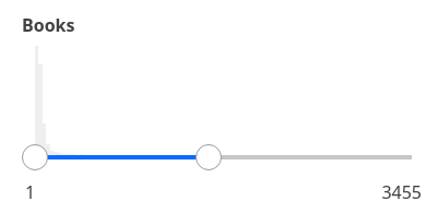
<DynamicRangeSlider componentId="DynamicRangeSensor" dataField="guests" />While DynamicRangeSlider only requires the above props to be used, it comes with many additional props for pre-selecting range values, setting the step value of the range slider, specifying labels for the range endpoints, whether to display histogram etc.
Usage With All Props
<DynamicRangeSlider
	componentId="DynamicRangeSensor"
	dataField="guests"
	title="Guests"
	defaultValue={(min, max) => ({
		start: min,
		end: Math.min(min + 5, max),
	})}
	rangeLabels={(min, max) => ({
		start: min + ' guest',
		end: max + ' guests',
	})}
	stepValue={1}
	showHistogram={true}
	showFilter={true}
	interval={2}
	react={{
		and: ['CategoryFilter', 'SearchFilter'],
	}}
	URLParams={true}
	loader="Loading ..."
	includeNullValues
/>
Props
-
componentId
Stringunique identifier of the component, can be referenced in other components'reactprop. -
dataField
StringDB data field to be mapped with the component's UI view.The selected range creates a database query on this field. -
nestedField
String[optional] use to set thenestedmapping field that allows arrays of objects to be indexed in a way that they can be queried independently of each other. Applicable only when dataField is a part ofnestedtype. -
title
String or JSX[optional] title of the component to be shown in the UI. -
defaultValue
Function[optional] a function that acceptsminandmaxrange values as parameters and returns an object representing current selection from the range withstartandendkeys. -
value
Object[optional] controls the current value of the component.It selects the item from the dynamic range (on mount and on update).Use this prop in conjunction withonChangefunction. -
onChange
function[optional] is a callback function which accepts component's current value as a parameter. It is called when you are using thevalueprop and the component's value changes. This prop is used to implement the controlled component behavior. -
rangeLabels
Function[optional] a function that acceptsminandmaxrange values as parameters and returns an object representing labels withstartandendkeys. -
showFilter
Boolean[optional] show the selected item as a filter in the selected filters view. Defaults totrue. -
snap
Boolean[optional] makes the slider snap on to points depending on thestepValuewhen the slider is released. Defaults totrue. When set tofalse,stepValueis ignored. -
stepValue
Number[optional] step value specifies the slider stepper. Value should be an integer greater than or equal to1and less thanMath.floor((range.end - range.start) / 2). Defaults to 1. -
tooltipTrigger
String[optional] trigger the tooltip according to the value specified. Can behover,focus,alwaysandnone. Defaults tonone. -
renderTooltipData
Function[optional] customize the rendered tooltip content via a function which receives the tooltip content and expects a JSX or String back. For example:renderTooltipData={data => ( <h5 style={{ color: 'red', textDecoration: 'underline' }}> {data} </h5> )} -
showHistogram
Boolean[optional] whether to display the range histogram or not. Defaults totrue. -
interval
Number[optional] set the histogram bar interval, applicable when showHistogram istrue. Defaults toMath.ceil((props.range.end - props.range.start) / 100) || 1. -
loader
String or JSX[optional] to display an optional loader while fetching the histogram stats. -
URLParams
Boolean[optional] enable creating a URL query string parameter based on the selected range of the slider. This is useful for sharing URLs with the component state. Defaults tofalse. -
includeNullValues
Boolean[optional] If you have sparse data or document or items not having the value in the specified field or mapping, then this prop enables you to show that data. Defaults tofalse. -
queryFormat
StringSet the date format to be used for querying data, default value is set todate. It can accept one of the following values:
queryFormat |
Representation as elasticsearch date |
|---|---|
epoch_millis (default) |
epoch_millis |
epoch_second |
epoch_second |
basic_time |
HHmmss.SSSZ |
basic_time_no_millis |
HHmmssZ |
date |
yyyy-MM-dd |
basic_date |
yyyyMMdd |
basic_date_time |
yyyyMMdd'T'HHmmss.SSSZ |
basic_date_time_no_millis |
yyyyMMdd'T'HHmmssZ |
date_time_no_millis |
yyyy-MM-dd'T'HH:mm:ssZZ |
Note:
queryFormatis mandatory to pass when dealing with date types.
- calendarInterval
String[optional] It sets the interval for aggreation-data when dealing with date-types. Default value is calculated internally based on the range -startandendvalues. It can accept one of the following:year,quarter,month,week,day,hour, andminute.
Demo
Styles
DynamicRangeSlider component supports innerClass prop with the following keys:
titlesliderlabel
Read more about it here.
Extending
DynamicRangeSlider component can be extended to
- customize the look and feel with
className,style. - update the underlying DB query with
customQuery. - connect with external interfaces using
beforeValueChange,onValueChangeandonQueryChange, - filter data using a combined query context via the
reactprop.
<DynamicRangeSlider
  ...
  className="custom-class"
  style={{"paddingBottom": "10px"}}
  customQuery={
    function(value, props) {
      return {
        query: {
            match: {
                data_field: "this is a test"
            }
        }
      }
    }
  }
  onValueChange={
    function(value) {
      console.log("current value: ", value)
      // set the state
      // use the value with other js code
    }
  }
  onQueryChange={
    function(prevQuery, nextQuery) {
      // use the query with other js code
      console.log('prevQuery', prevQuery);
      console.log('nextQuery', nextQuery);
    }
  }
  beforeValueChange={
    function(value) {
      // called before the value is set
      // returns a promise
      return new Promise((resolve, reject) => {
        // update state or component props
        resolve()
        // or reject()
      })
    }
  }
  react={{
    "and": ["ListSensor"]
  }}
/>-
className
StringCSS class to be injected on the component container. -
style
ObjectCSS styles to be applied to the DynamicRangeSlider component. -
customQuery
Functiontakes value and props as parameters and returns the data query to be applied to the component, as defined in Elasticsearch Query DSL.Note:customQuery is called on value changes in the DynamicRangeSlider component as long as the component is a part ofreactdependency of at least one other component. -
beforeValueChange
Functionis a callback function which accepts component's future value as a parameter and returns a promise. It is called everytime before a component's value changes. The promise, if and when resolved, triggers the execution of the component's query and if rejected, kills the query execution. This method can act as a gatekeeper for query execution, since it only executes the query after the provided promise has been resolved.Note:
If you're using Reactivesearch version >=
3.3.7,beforeValueChangecan also be defined as a synchronous function.valueis updated by default, unless you throw anErrorto reject the update. For example:beforeValueChange = value => { // The update is accepted by default if (value.start > 3000) { // To reject the update, throw an error throw Error('Start value must be less than or equal to 3000.'); } }; -
onValueChange
Functionis a callback function which accepts component's current value as a parameter. It is called everytime the component's value changes. This prop is handy in cases where you want to generate a side-effect on value selection. For example: You want to show a pop-up modal with the valid discount coupon code when a user selects a particular range in a DynamicRangeSlider. -
onQueryChange
Functionis a callback function which accepts component's prevQuery and nextQuery as parameters. It is called everytime the component's query changes. This prop is handy in cases where you want to generate a side-effect whenever the component's query would change. -
react
Objectspecify dependent components to reactively update DynamicRangeSlider's data view.- key
Stringone ofand,or,notdefines the combining clause.- and clause implies that the results will be filtered by matches from all of the associated component states.
- or clause implies that the results will be filtered by matches from at least one of the associated component states.
- not clause implies that the results will be filtered by an inverse match of the associated component states.
- value
String or Array or ObjectStringis used for specifying a single component by itscomponentId.Arrayis used for specifying multiple components by theircomponentId.Objectis used for nesting other key clauses.
- key
-
index
String[optional] The index prop can be used to explicitly specify an index to query against for this component. It is suitable for use-cases where you want to fetch results from more than one index in a single ReactiveSearch API request. The default value for the index is set to theappprop defined in the ReactiveBase component.Note: This only works when
enableAppbaseprop is set to true inReactiveBase.
Examples
See more stories for DynamicRangeSlider on playground.


